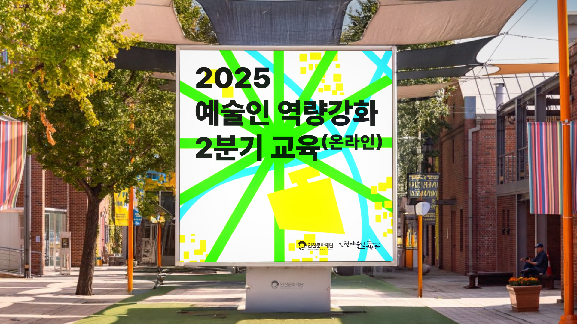
2025 2분기 예술인 역량강화 교육 배너와 카드뉴스는 단순한 안내물이 아닌, 참여를 유도하는 그래픽+에디토리얼 디자인으로 풀어냈습니다.
정보 전달이 핵심 목적이지만, 딱딱한 행정 문서의 느낌을 벗어나도록 예술인의 여정을 게임 맵 비주얼로 재해석했습니다.
녹색 라인은 경로와 선택지를, 파란 곡선은 흐름과 지형을, 노란 블록은 성취의 지점을 상징해 교육 과정을 하나의 플레이 필드처럼 표현했습니다. 강렬한 색 대비와 굵은 서체는 주목성을 높이고, 동시에 “성장의 단계”라는 메시지를 직관적으로 담아냈습니다.
The 2025 2Q Artist Capacity-Building banner and card news were designed not just as announcements but as engaging graphic + editorial pieces. While clear information delivery was the main goal, the visuals reinterpret the program as an artist’s journey through a game map.
Green lines symbolize paths and choices, blue curves suggest flows and terrains, and yellow blocks mark achievements—turning the education process into a playfield for growth.
Bold typography and vivid contrasts enhance visibility while conveying the message of “progress through stages.”\
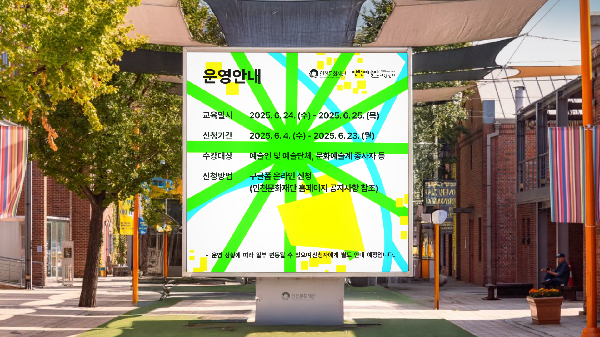
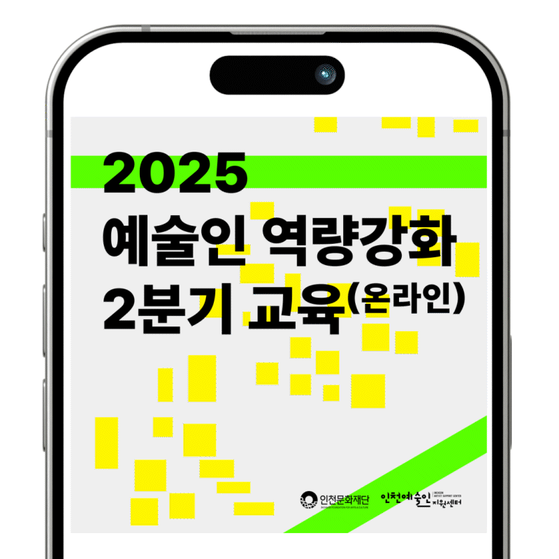