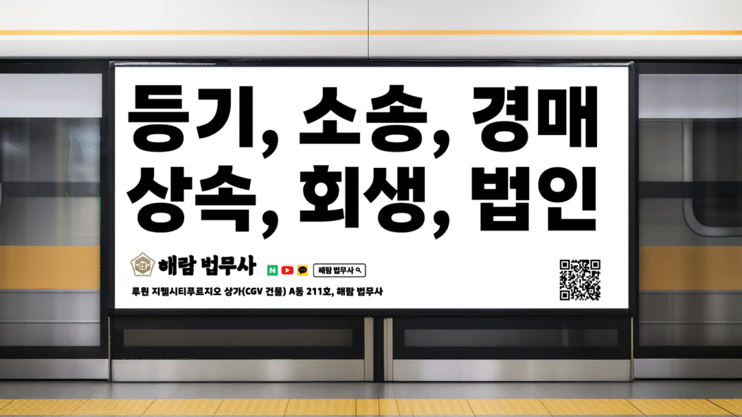
해람법무사 사무소의 브랜딩은 법무사라는 직업이 본질적으로 요구하는 전문성과 신뢰를 시각적으로 드러내는 데서 출발했습니다. 고객이 법무사를 찾는 순간은 인생의 중요한 분기점이기에, 사무소의 첫인상은 곧 “믿고 맡길 수 있는가”라는 질문에 답해야 합니다. 따라서 친근함보다는 단단한 권위와 무게감을 전달하는 것이 핵심 과제였습니다.
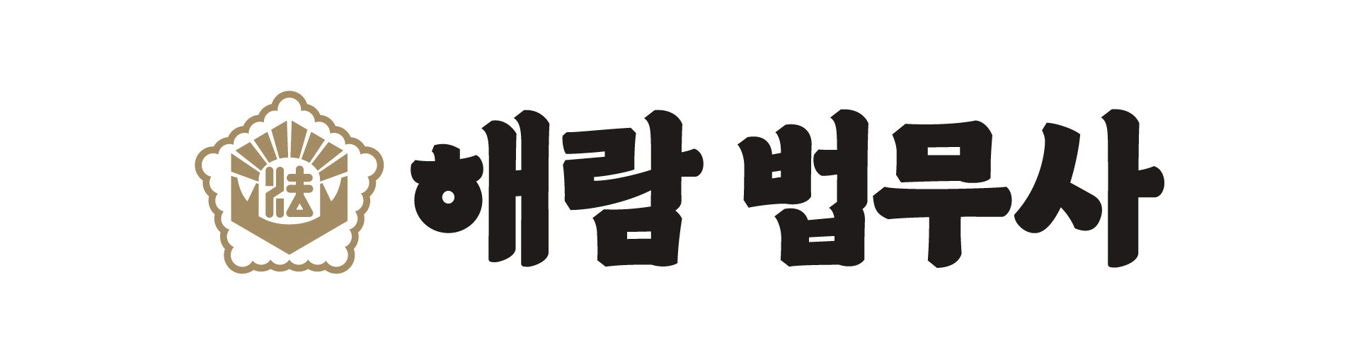
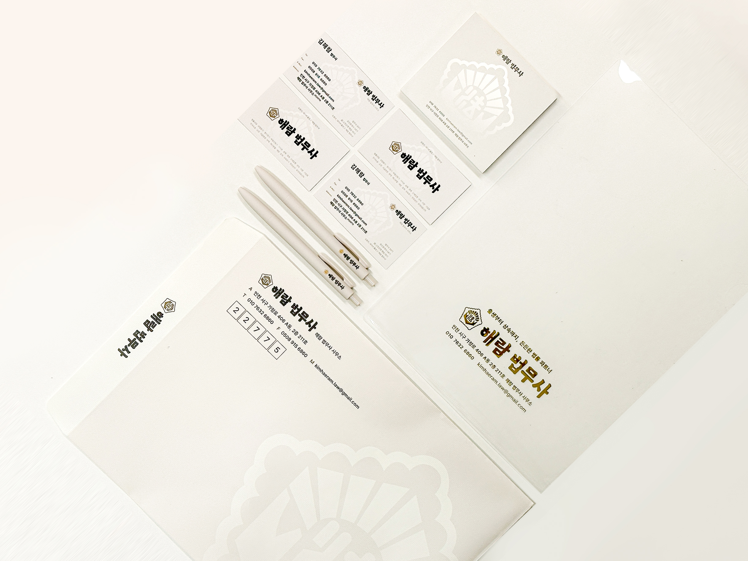
이를 구체화하기 위해 법무사 공통 상징을 적극적으로 선택하고, 로고타입은 직접 제작한 굵은 명조 레터링으로 완성했습니다. 궁서체에 가까운 구조는 법적 문서의 권위를 떠올리게 하며, 흔들림 없는 단단함을 시각적으로 표현합니다.
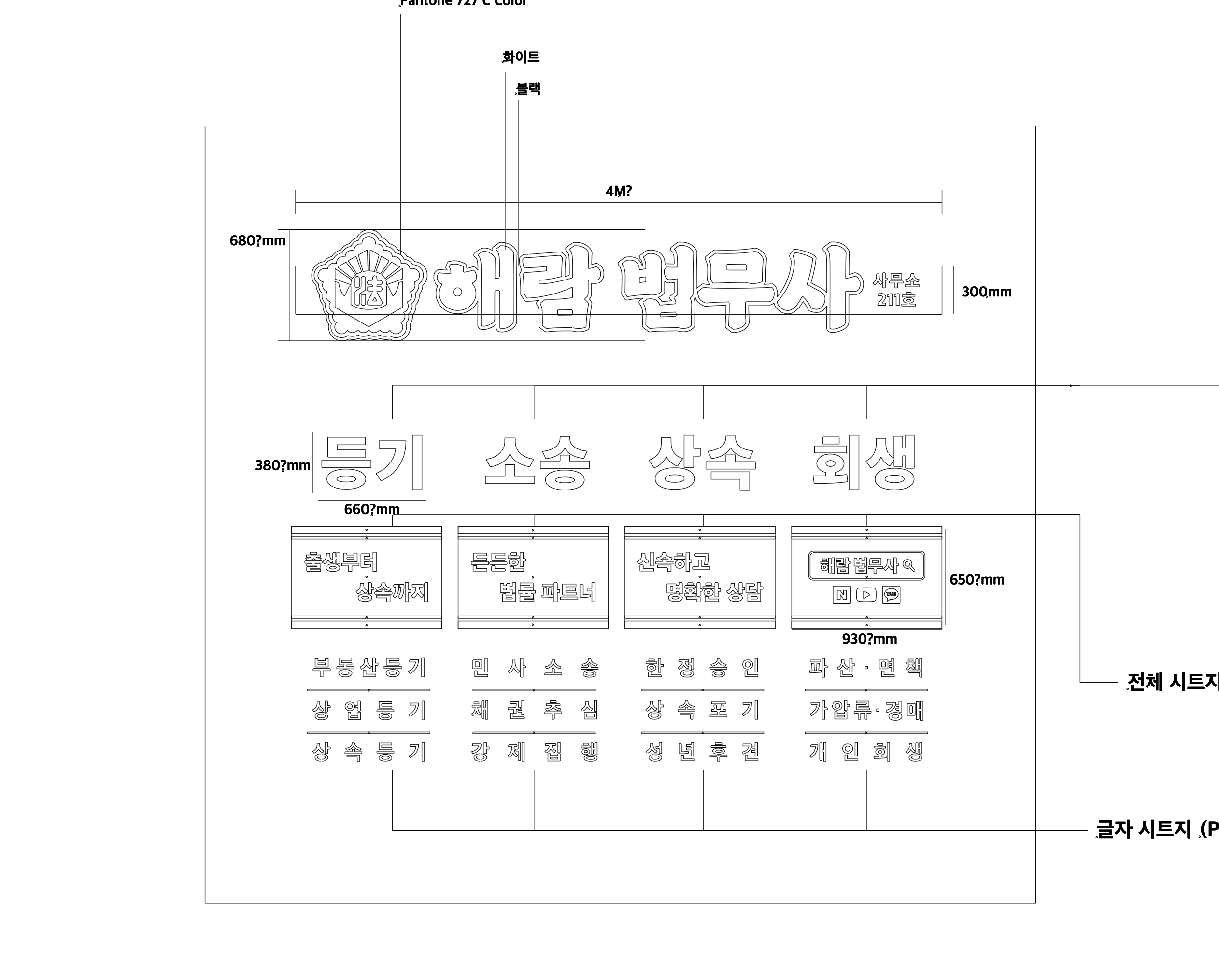
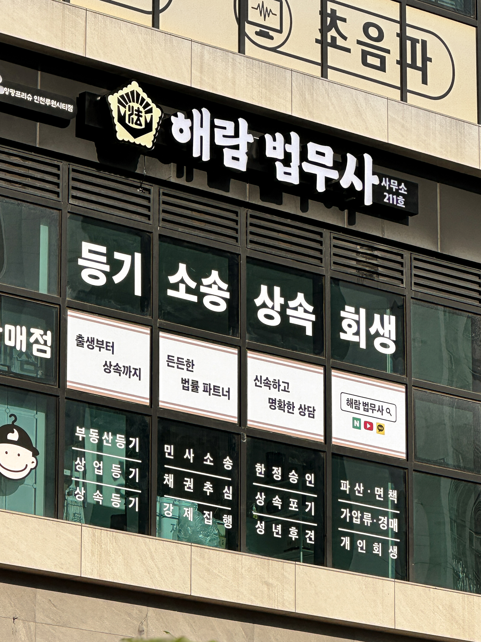
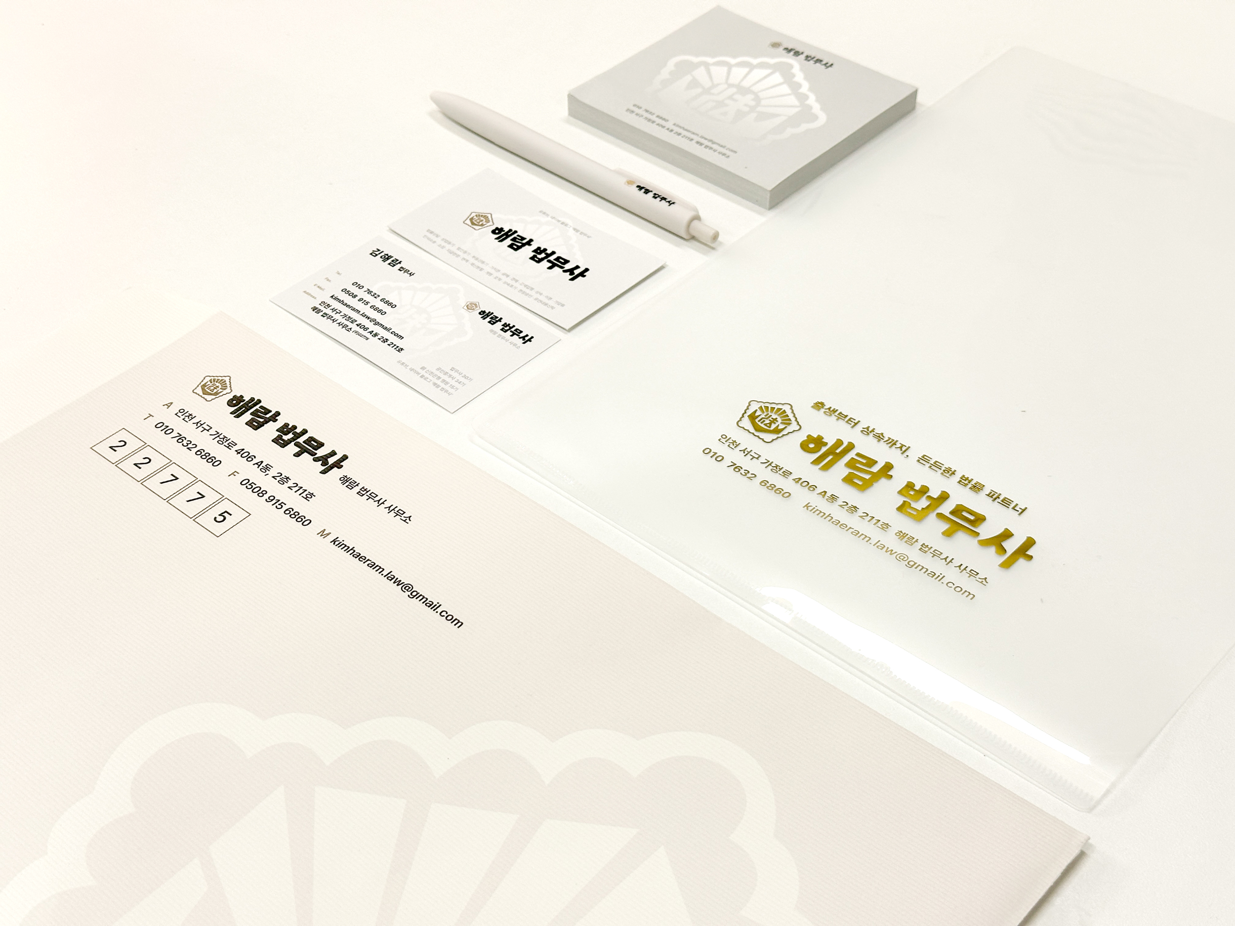
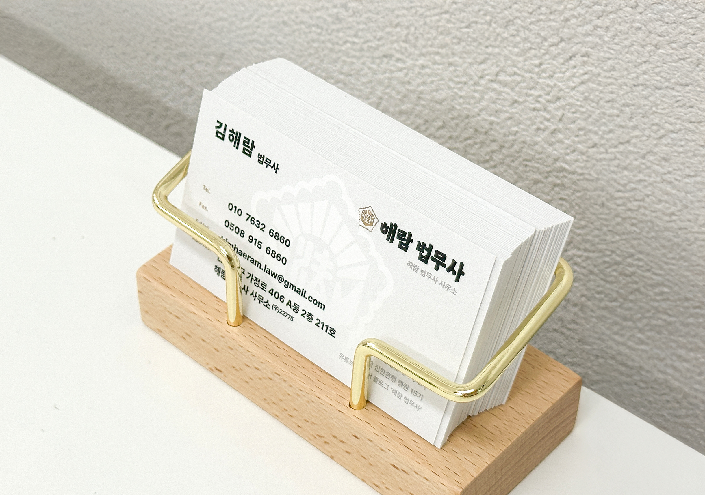
컬러는 블랙과 골드를 조합했습니다. 블랙은 무게감과 단호함을, 골드는 전문성과 고급스러움을 상징해 사무소의 성격을 직관적으로 드러냅니다. 이 아이덴티티는 간판, 명함, 봉투, 시트 등 고객 접점 전반에 일관되게 적용되어, 마주하는 순간부터 동일한 신뢰 이미지를 경험하도록 설계되었습니다.
결국 해람법무사 사무소의 디자인은 단순한 장식이 아니라, 전문성과 신뢰를 곧바로 각인시키는 장치입니다. 고객에게 안심과 확신을 제공하며, 법무사라는 직업이 지닌 무게와 권위를 디자인 언어로 풀어낸 결과물입니다
The branding of Haeram Law Office emphasizes the core values of professionalism and trust inherent to the legal profession. The logo uses a custom hand-drawn bold serif typeface inspired by traditional legal documents, delivering authority and stability. Black and gold were chosen as the primary colors: black conveys weight and firmness, while gold adds sophistication and expertise. Applied consistently across signage, stationery, and office materials, the identity ensures that clients immediately perceive the office as a reliable and trustworthy legal partner.
해람법무사 사무소의 브랜딩은 법무사라는 직업이 본질적으로 요구하는 전문성과 신뢰를 시각적으로 드러내는 데서 출발했습니다. 고객이 법무사를 찾는 순간은 인생의 중요한 분기점이기에, 사무소의 첫인상은 곧 “믿고 맡길 수 있는가”라는 질문에 답해야 합니다. 따라서 친근함보다는 단단한 권위와 무게감을 전달하는 것이 핵심 과제였습니다.
이를 구체화하기 위해 법무사 공통 상징을 적극적으로 선택하고, 로고타입은 직접 제작한 굵은 명조 레터링으로 완성했습니다. 궁서체에 가까운 구조는 법적 문서의 권위를 떠올리게 하며, 흔들림 없는 단단함을 시각적으로 표현합니다.
컬러는 블랙과 골드를 조합했습니다. 블랙은 무게감과 단호함을, 골드는 전문성과 고급스러움을 상징해 사무소의 성격을 직관적으로 드러냅니다. 이 아이덴티티는 간판, 명함, 봉투, 시트 등 고객 접점 전반에 일관되게 적용되어, 마주하는 순간부터 동일한 신뢰 이미지를 경험하도록 설계되었습니다.
결국 해람법무사 사무소의 디자인은 단순한 장식이 아니라, 전문성과 신뢰를 곧바로 각인시키는 장치입니다. 고객에게 안심과 확신을 제공하며, 법무사라는 직업이 지닌 무게와 권위를 디자인 언어로 풀어낸 결과물입니다
The branding of Haeram Law Office emphasizes the core values of professionalism and trust inherent to the legal profession. The logo uses a custom hand-drawn bold serif typeface inspired by traditional legal documents, delivering authority and stability. Black and gold were chosen as the primary colors: black conveys weight and firmness, while gold adds sophistication and expertise. Applied consistently across signage, stationery, and office materials, the identity ensures that clients immediately perceive the office as a reliable and trustworthy legal partner.