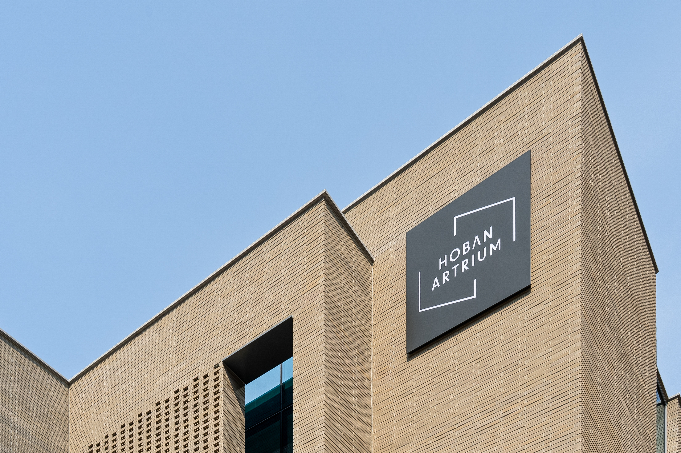
호반아트리움은 호반문화재단이 운영하는 복합 문화예술 공간으로, 시민들의 일상 속에 예술적 경험을 불어넣는 전시관입니다. 기존 아이덴티티는 단순하고 평범해 공간의 성격과 비전을 충분히 담아내지 못했고, 이번 리브랜딩은 “일상 속에서 예술을 마주하는 관문”을 새롭게 구축하는 데서 출발했습니다.
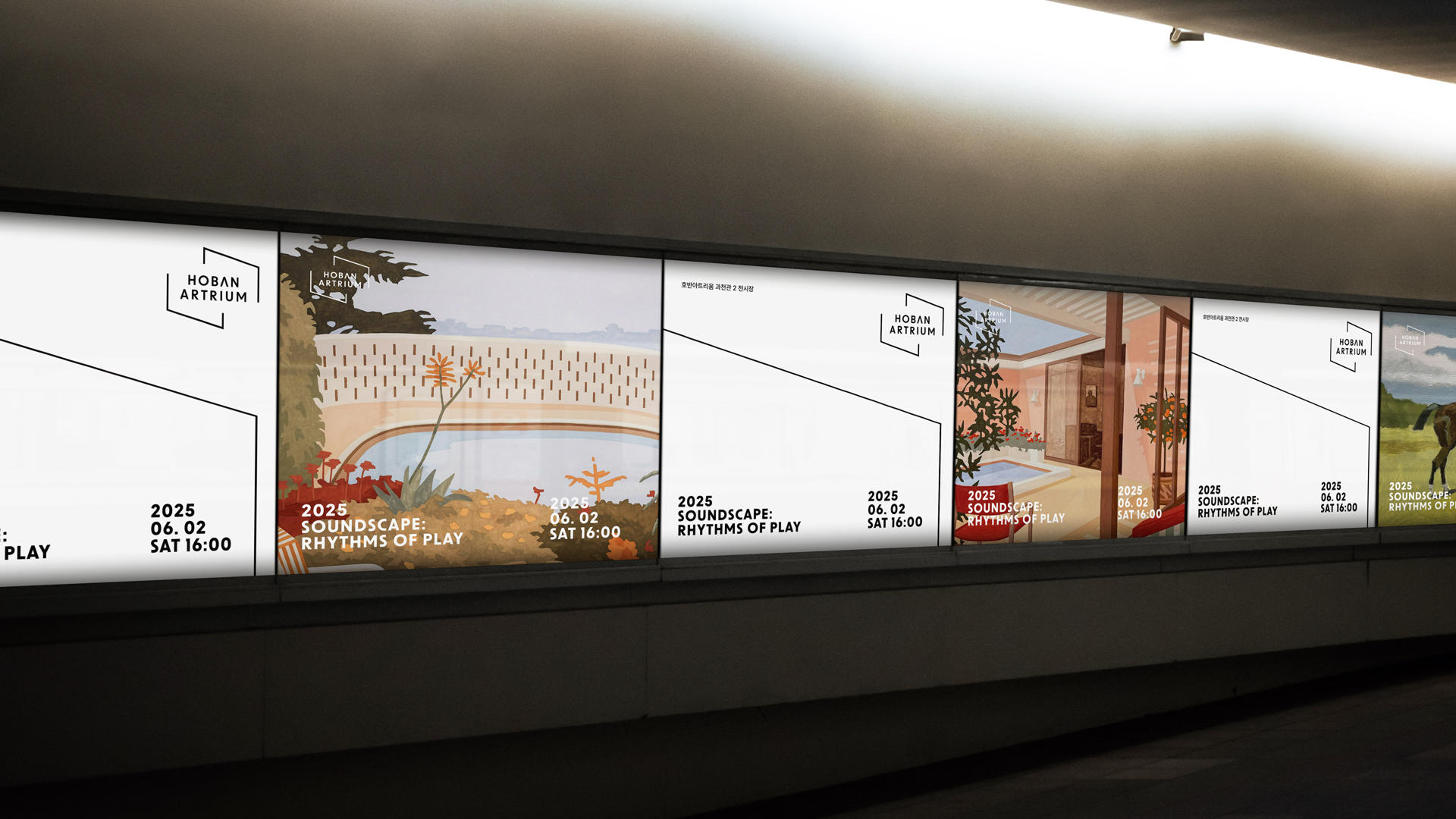
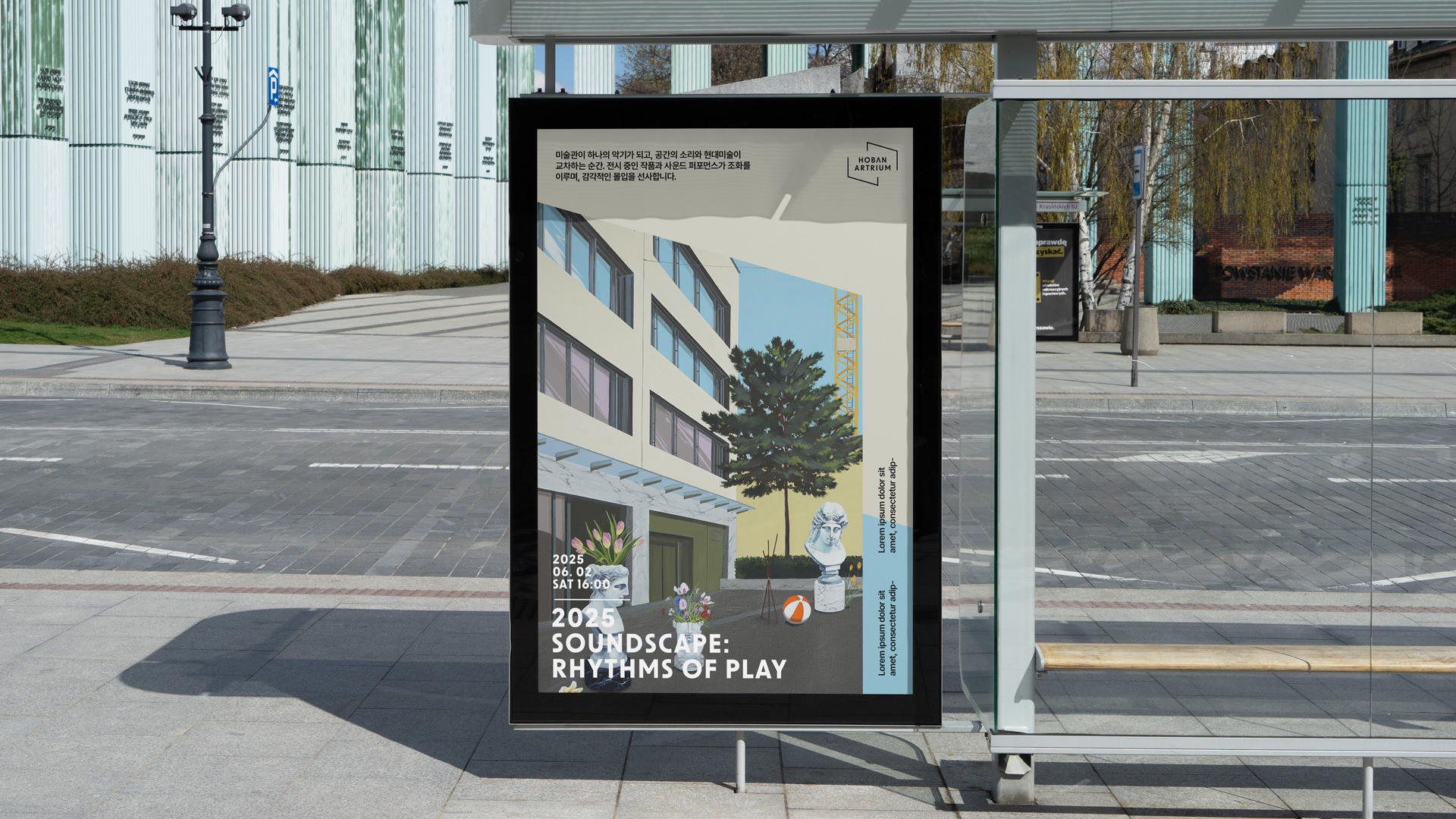
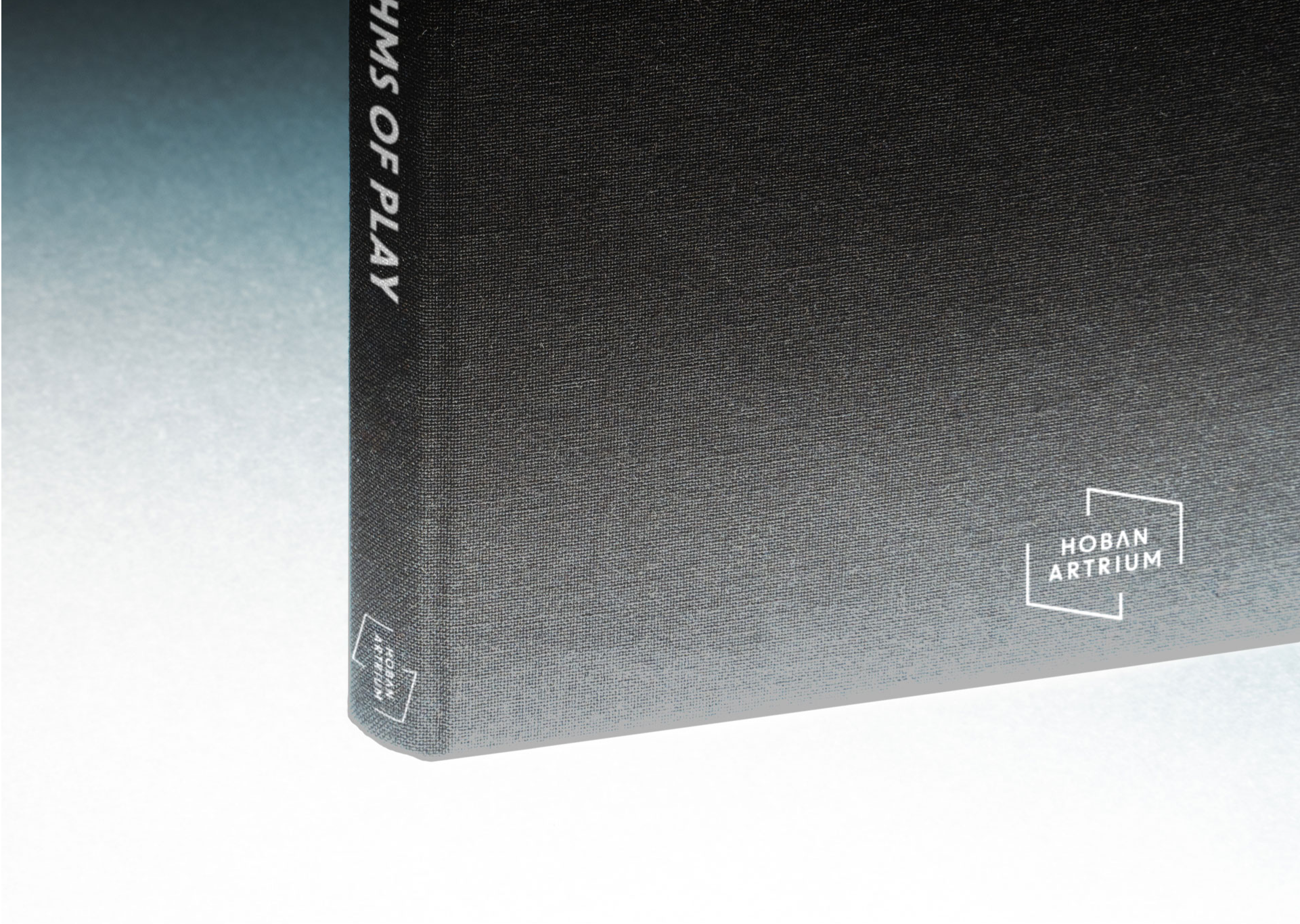
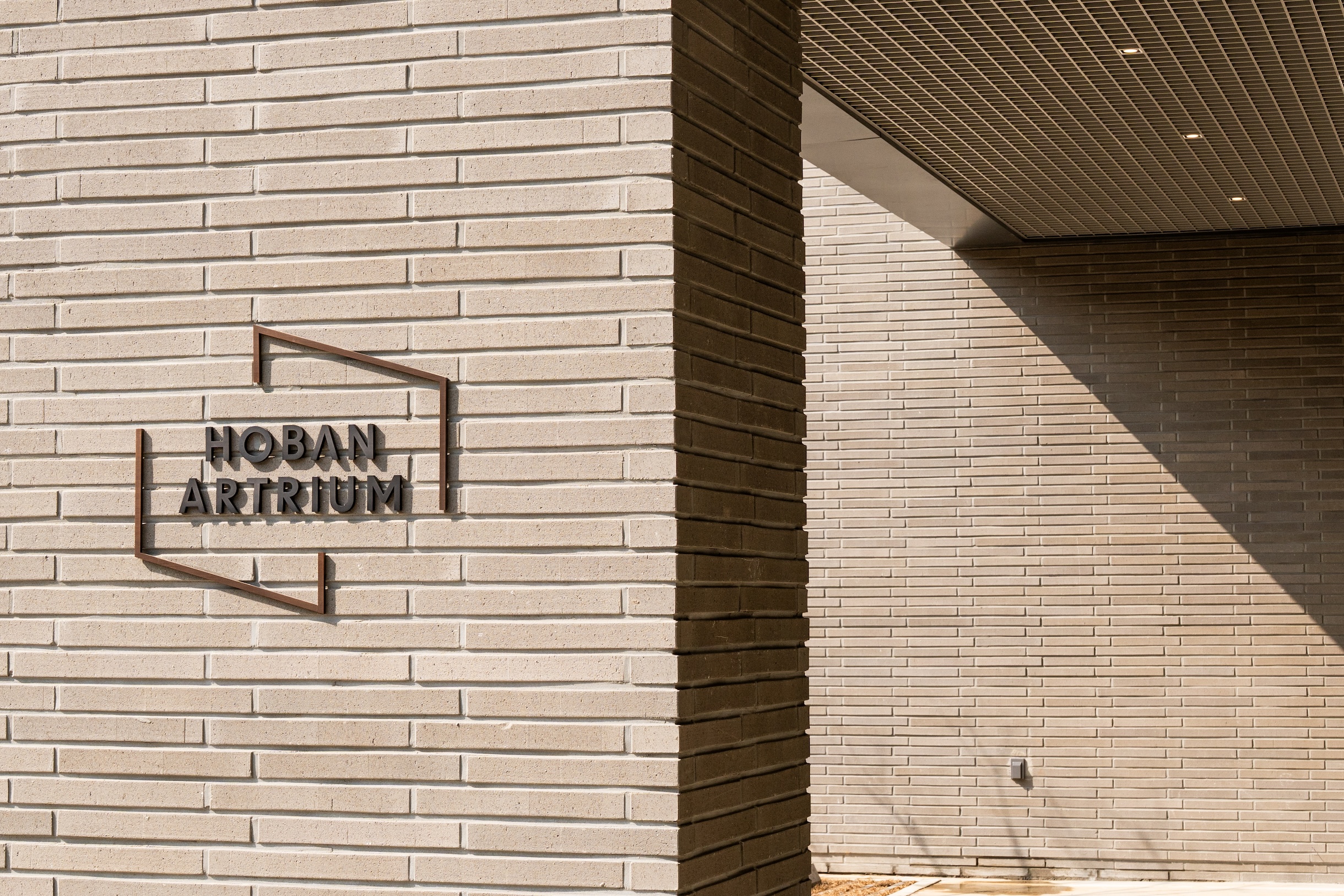
새로운 아이덴티티의 중심은 프레임(Frame)입니다. 이 프레임은 단순한 장식이 아니라, 일상과 예술을 구분 짓는 동시에 이어주는 경계이자 창으로 작동합니다. 열린 구조로 설계된 선은 닫히지 않고 유연하게 변주되며, 호반아트리움에서 펼쳐지는 다채로운 전시와 문화 활동을 담아내는 프레임이 됩니다.
디자인 요소 또한 이 철학을 구체화합니다. 간결한 산세리프 서체는 현대적이고 공공적인 신뢰감을 부여하고, 화이트 블랙의 대비는 예술의 생동감과 예술의 스펙트럼을 상징합니다. 프레임 모티프는 사인, 포스터, 온라인 콘텐츠 등 다양한 매체로 확장되어 호반아트리움만의 시각 언어를 완성합니다.
이번 리브랜딩은 호반아트리움을 단순한 전시관을 넘어, 도시 속에서 누구나 예술을 마주할 수 있는 열린 문화 플랫폼으로 재정의하는 과정이었습니다.
HOBAN ARTRIUM, operated by the Hoban Cultural Foundation, is a cultural art space that brings artistic experiences into everyday life. The former identity felt too generic, so this rebranding set out to create “a gateway to encounter art in daily life.”
The new identity centers on the frame—more than decoration, it acts as a boundary and window linking life and art. Its open structure shifts flexibly, symbolizing the exhibitions and cultural programs within Hoban Atrium. A clean sans-serif typeface conveys modern trust, while orange and gray express vitality and stability. The frame motif extends across signage, posters, and digital content, forming a consistent visual language.
Through this rebranding, HOBAN ARTRIUM is redefined as an open platform where anyone can meet art in the city.
호반아트리움은 호반문화재단이 운영하는 복합 문화예술 공간으로, 시민들의 일상 속에 예술적 경험을 불어넣는 전시관입니다. 기존 아이덴티티는 단순하고 평범해 공간의 성격과 비전을 충분히 담아내지 못했고, 이번 리브랜딩은 “일상 속에서 예술을 마주하는 관문”을 새롭게 구축하는 데서 출발했습니다.
새로운 아이덴티티의 중심은 프레임(Frame)입니다. 이 프레임은 단순한 장식이 아니라, 일상과 예술을 구분 짓는 동시에 이어주는 경계이자 창으로 작동합니다. 열린 구조로 설계된 선은 닫히지 않고 유연하게 변주되며, 호반아트리움에서 펼쳐지는 다채로운 전시와 문화 활동을 담아내는 프레임이 됩니다.
디자인 요소 또한 이 철학을 구체화합니다. 간결한 산세리프 서체는 현대적이고 공공적인 신뢰감을 부여하고, 화이트 블랙의 대비는 예술의 생동감과 예술의 스펙트럼을 상징합니다. 프레임 모티프는 사인, 포스터, 온라인 콘텐츠 등 다양한 매체로 확장되어 호반아트리움만의 시각 언어를 완성합니다.
이번 리브랜딩은 호반아트리움을 단순한 전시관을 넘어, 도시 속에서 누구나 예술을 마주할 수 있는 열린 문화 플랫폼으로 재정의하는 과정이었습니다.
HOBAN ARTRIUM, operated by the Hoban Cultural Foundation, is a cultural art space that brings artistic experiences into everyday life. The former identity felt too generic, so this rebranding set out to create “a gateway to encounter art in daily life.”
The new identity centers on the frame—more than decoration, it acts as a boundary and window linking life and art. Its open structure shifts flexibly, symbolizing the exhibitions and cultural programs within Hoban Atrium. A clean sans-serif typeface conveys modern trust, while orange and gray express vitality and stability. The frame motif extends across signage, posters, and digital content, forming a consistent visual language.
Through this rebranding, HOBAN ARTRIUM is redefined as an open platform where anyone can meet art in the city.