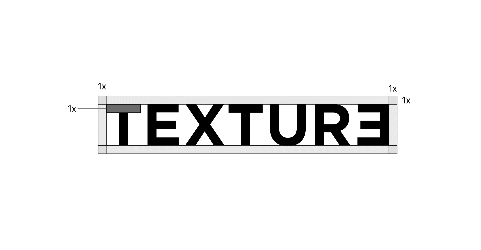
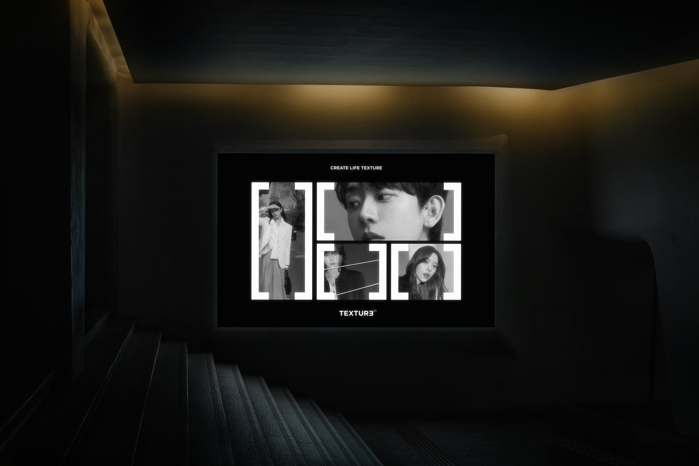
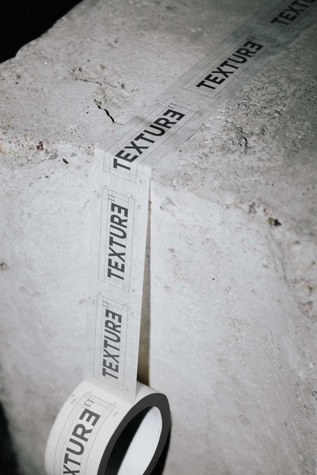
TEXTURE 아이덴티티는 새로운 네이밍과 함께 출발하는 브랜드의 정체성을 시각화한 디자인입니다. ‘질감’이라는 단어가 가진 의미를 확장해 결·프레임·연결을 핵심 키워드로 삼았으며, 로고타입의 마지막 ‘E’를 반전시켜 독창성과 균형을 동시에 담았습니다.
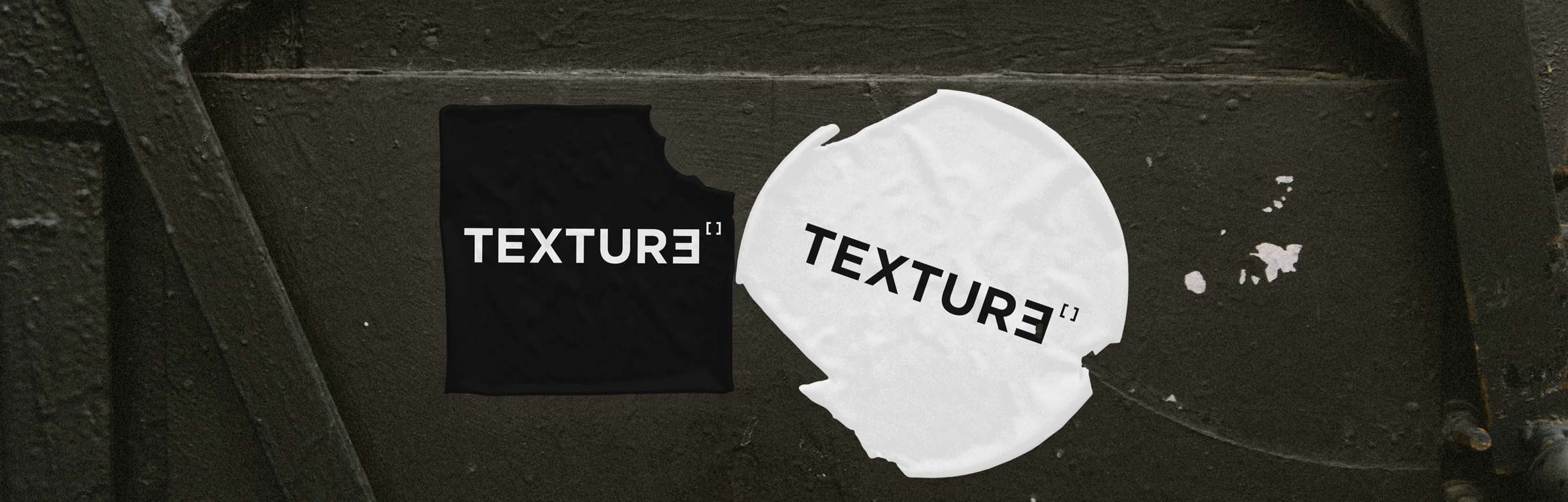
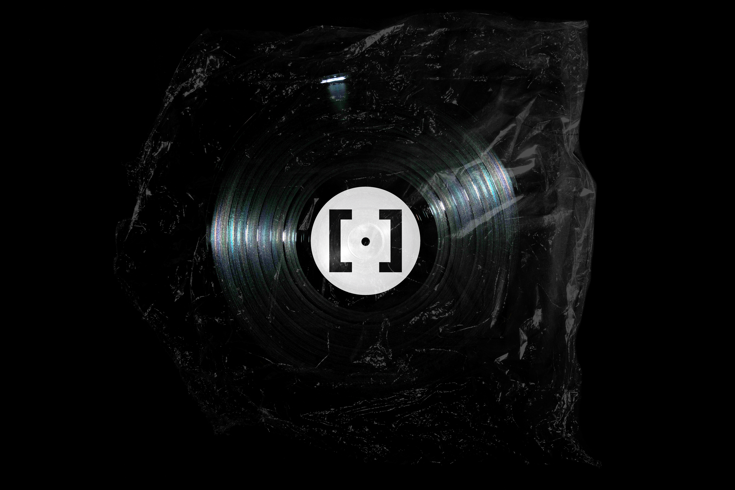
여기서 파생된 심볼 [ ]는 TEXTURE의 핵심을 드러냅니다. 이는 개인과 브랜드, 크리에이터와 콘텐츠를 잇는 프레임이자 매개체로서, 다양한 가치를 담고 교차시키는 역할을 합니다. 로고와 심볼은 단독 또는 결합해 활용 가능하며, 흑백 대비와 질감 있는 이미지가 브랜드명이 가진 촉각적 감각을 강화합니다.
TEXTURE는 K-뷰티, K-패션, K-콘텐츠를 아우르는 글로벌 그룹으로 자리매김합니다. 단순한 감각을 넘어 각자의 개성과 정체성을 연결하는 새로운 플랫폼임을 선언합니다.
The TEXTURE identity marks a new beginning with its fresh naming, visualizing the brand’s essence. Expanding on the meaning of “texture,” it adopts grain, frame, and connection as core concepts. The logotype reverses the final “E,” expressing both originality and balance.
The symbol [ ] embodies TEXTURE’s core, serving as a frame and medium that links individuals and brands, creators and content. Used alone or combined with the logotype, it gains strength through black-and-white contrast and tactile imagery.
TEXTURE emerges as a global group in K-Beauty, K-Fashion, and K-Content, declaring itself a platform that connects individuality and identity.
TEXTURE 아이덴티티는 새로운 네이밍과 함께 출발하는 브랜드의 정체성을 시각화한 디자인입니다. ‘질감’이라는 단어가 가진 의미를 확장해 결·프레임·연결을 핵심 키워드로 삼았으며, 로고타입의 마지막 ‘E’를 반전시켜 독창성과 균형을 동시에 담았습니다.
여기서 파생된 심볼 [ ]는 TEXTURE의 핵심을 드러냅니다. 이는 개인과 브랜드, 크리에이터와 콘텐츠를 잇는 프레임이자 매개체로서, 다양한 가치를 담고 교차시키는 역할을 합니다. 로고와 심볼은 단독 또는 결합해 활용 가능하며, 흑백 대비와 질감 있는 이미지가 브랜드명이 가진 촉각적 감각을 강화합니다.
TEXTURE는 K-뷰티, K-패션, K-콘텐츠를 아우르는 글로벌 그룹으로 자리매김합니다. 단순한 감각을 넘어 각자의 개성과 정체성을 연결하는 새로운 플랫폼임을 선언합니다.
The TEXTURE identity marks a new beginning with its fresh naming, visualizing the brand’s essence. Expanding on the meaning of “texture,” it adopts grain, frame, and connection as core concepts. The logotype reverses the final “E,” expressing both originality and balance.
The symbol [ ] embodies TEXTURE’s core, serving as a frame and medium that links individuals and brands, creators and content. Used alone or combined with the logotype, it gains strength through black-and-white contrast and tactile imagery.
TEXTURE emerges as a global group in K-Beauty, K-Fashion, and K-Content, declaring itself a platform that connects individuality and identity.